Direct Brockerage (NBC)
PROBLEM
There was great pressure to improve the user experience as the competition in Canada and elsewhere was fierce. Ratings by analysts were unfavourable. Even though many design firms claim to have expertise, most emphasize visual rather than functional design. In brokerage, the main factor is to ensure that the content and organization of information is compatible with the task. This challenge is heightened because there are many investor profiles with potentially different needs. For example day traders, buy and hold, those looking for dividend securities, others who trade options, etc
APPROACH
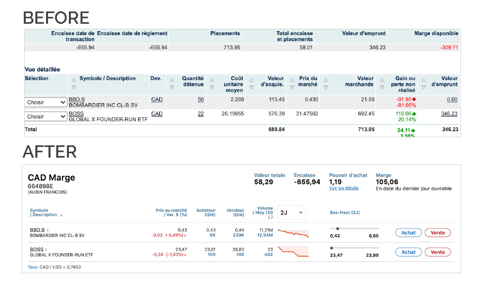
The president of direct brokerage who had already done business with us at Desjardins called on our services. We first did cognitive task analysis with the main users. We then carried out tests and analyses with competitor sites in Canada and the USA. Following that we did a complete redesign of the user interface, first from a functional point of view in terms of the content and organization of information and secondly visually.
RESULTS
The new brokerage site has been available since the end of 2019 and has worked its way up through the rating agency ranks to the top tier.
EXPERTISE USED
- USER RESEARCH
- UI DESIGN
- USER TESTING


